There are many packages to draw maps in R. Personally, I prefer to use leaflet and ggplot2. leaflet is a web application so that we can explore data interactively, and ggplot2 can merge data conveniently.
ggplot2
The map border can be drawn by borders(). Let’s look at an example of USA map:
library(ggplot2)
library(maps)
ggplot() +
  borders("state")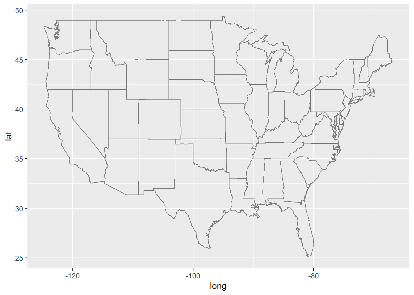
How to add some shapes into the map? If you are familiar with ggplot2, it would be very easy.
Us.cities provides population and location informations of U.S. cities.
data(us.cities)
knitr::kable(head(us.cities))| name | country.etc | pop | lat | long | capital |
|---|---|---|---|---|---|
| Abilene TX | TX | 113888 | 32.45 | -99.74 | 0 |
| Akron OH | OH | 206634 | 41.08 | -81.52 | 0 |
| Alameda CA | CA | 70069 | 37.77 | -122.26 | 0 |
| Albany GA | GA | 75510 | 31.58 | -84.18 | 0 |
| Albany NY | NY | 93576 | 42.67 | -73.80 | 2 |
| Albany OR | OR | 45535 | 44.62 | -123.09 | 0 |
Us.cities is dataset of cities of USA. When we draw a map, we need
Now we want to mark cities with population more than 500,000 in the map:
us.cities <- subset(us.cities, pop > 500000)
ggplot(us.cities, aes(x = long, y = lat)) +
geom_point()+
borders("state")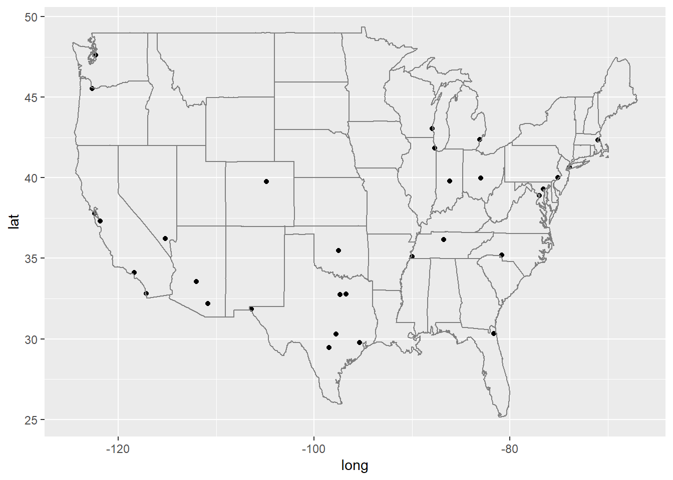 Of course we can make colour represent population size:
us.cities <- subset(us.cities, pop > 500000)
ggplot(us.cities, aes(x = long, y = lat)) +
  geom_point(aes(color = pop))+
  borders("state")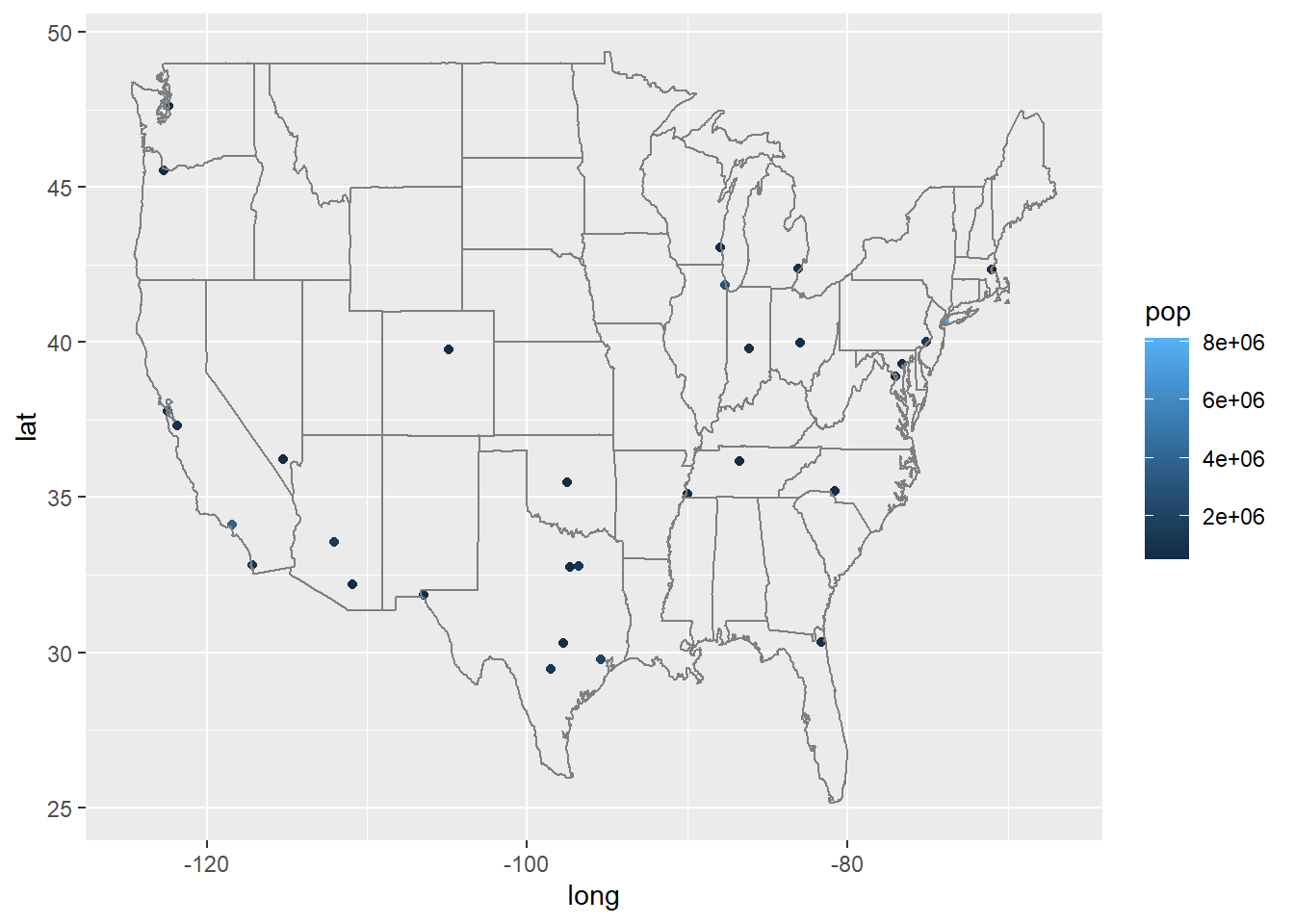
If you are not so satisfied with the Coordinate ratio, then:
library(mapproj)
ggplot(us.cities, aes(x = long, y = lat)) +
geom_point(aes(color = pop))+
borders("state")+
coord_map()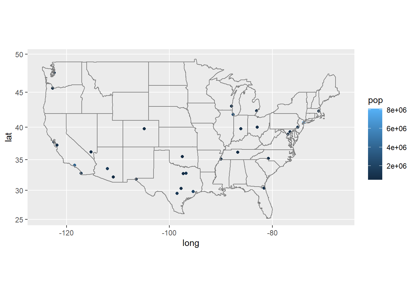 It is super suitable for a quick look at data map.
Leaflet
Leaflet is a very popular tool based on java. It provides R package so that we can also use it.
library(leaflet)
library(widgetframe)
## Loading required package: htmlwidgets

GetURL <- function(service, host = "basemap.nationalmap.gov") {
  sprintf("https://%s/arcgis/services/%s/MapServer/WmsServer", host, service)
}
pal <- colorNumeric(
  palette = colorRampPalette(c("skyblue", "darkblue"))(length(bound$mean)),
  domain = bound$mean
)
map <- leaflet(bound) %>%
  setView(lng = -95, lat = 40, zoom = 4)%>%
  addPolygons(color = ~ pal(mean), weight = 1, smoothFactor = 0.5,
              opacity = 1.0, fillOpacity = 0.5,label = ~htmltools::htmlEscape(paste(huc2, name)),
              highlightOptions = highlightOptions(color = "white", weight = 2,
                                                  bringToFront = TRUE),
              group = "Region")%>%
  addCircleMarkers(data = Siteinfo,
                   lng = ~dec_lon_va,
                   lat = ~dec_lat_va,
                   radius = ~3,
                   stroke = FALSE,
                   fill = TRUE,
                   color = "red",
                   fillOpacity = 0.4,
                   group = "Site"
  )%>%
  addLegend("bottomright",
            pal = pal,
            values = ~mean,
            title = "Mean",
            labFormat = labelFormat(),
            opacity = 1,
            group="Region"
  ) %>%
  addWMSTiles(GetURL("USGSHydroCached"),layers = "0", group = "River")%>%
  addProviderTiles("Esri.WorldImagery",group = "Topography")%>%
  addLayersControl(
    overlayGroups =c("River", "Topography", "Region","Site"),
    options = layersControlOptions(collapsed=FALSE)
  )
frameWidget(map)